
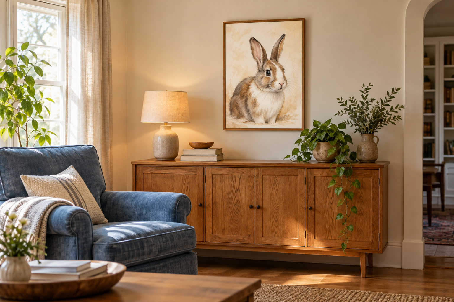
A room can feel finished before the most personal thing arrives. You have a sofa that works, a wall color you like, and a few objects collected over time. Then you decide to add a portrait of your pet, and a surprisingly small purchase starts raising bigger questions. Does the frame match? Should the cushions change? Would another paint color make the artwork look better?
That is how one picture can turn into an unnecessary decorating project. A pet portrait does not need an entirely new setting to belong in your home. The useful starting point is to decide what stays, what the artwork should express, and how little needs to change around it.
Start with the things you already want to keep
Before looking at artwork, identify three parts of the room you would be happy to leave alone. Perhaps they are a blue armchair, an old oak cabinet, and a warm white wall. Treat those as fixed choices rather than problems waiting for a solution.
This gives the decision a boundary. You are finding a place for one meaningful piece, not reviewing every object you own. It also makes browsing easier: a beautiful portrait shown in a dramatic showroom may still work in your home, but you do not have to recreate the showroom.
Take a quick photograph of the actual space in ordinary daylight. Include the things that normally live there, such as a reading lamp or a stack of books. A cleared and carefully staged corner can give you a misleading idea of how much visual space is available.
Keep that photograph nearby as you compare options. Your existing room is the reference, not an empty room you might someday have.
Set a limit for the complete addition, including any frame or hanging supplies it requires. If a choice only seems workable after you replace several other things, put it aside and look again. That does not make the artwork a bad choice in general; it may simply ask more of this particular room than you want to give.
Keep the pet recognizable before making the colors match
A portrait can fit a room beautifully and still feel wrong if it loses what makes the animal familiar. The uneven white patch on a rabbit’s nose, the tilt of a bird’s head, or a dog’s slightly crooked ears may matter more than a perfectly coordinated background.
Write down two or three details you want the artwork to retain. Separate physical features from general mood: “white patch above the left eye” is more useful than “cute,” while “quiet and curious” describes a different expression from “bright and playful.” This is especially helpful when several reference photographs show different sides of the same pet.
When browsing custom pet portraits from Pawfolio Art, use those details as your first filter. A style should leave room for the pet’s identity; matching the room comes after that. Check the individual design’s available options before assuming its background, pose, or other elements can be changed.
If the most recognizable photograph includes an awkward background, ask what the artist needs from the image. Do not choose a less representative photograph simply because its colors suit your curtains.
Give the portrait one connection to its surroundings
Artwork does not have to repeat every color in a room. One shared detail can be enough to make the relationship feel intentional.
Imagine a room with a faded blue chair, honey-colored wood, and cream walls. A portrait with a small amount of muted blue could connect to the chair. Alternatively, a warm frame could relate to the wood. You would not need to do both, and you would not need the pet’s fur to become part of the decorating palette.
That connection can also come from the overall feeling. An informal, playful portrait may sit comfortably beside well-used books and family photographs even when their colors differ. A quieter composition may suit a corner where the existing objects already have plenty of detail.
If you are considering a personalized pet portrait with a strong costume or a colorful setting, let that be the lively element. The rest of the room can remain ordinary. There is no requirement to add matching ornaments or turn the space into a pet-themed display.
Look for a conversation between the picture and its surroundings, rather than a complete set.
Separate the artwork decision from the display decision
It is easy to blame an image when the real issue is how it is presented. A heavy decorative frame, a reflective surface, or a deep edge can change how a piece feels beside furniture you already own.
Think about the artwork and its physical format as two decisions. First, decide whether the portrait itself feels right. Then consider whether you want a framed boundary, a flatter presentation, or the visible depth of a stretched canvas.
Material labels deserve a closer look here. Different sellers use “print” differently, so do not assume it always means paper. Pawfolio’s Art Print and Canvas comparison explains its flat prints on textured fabric and canvases stretched over a solid-wood inner frame. Those construction differences help explain what you would actually be placing in the room.
If you hope to reuse a frame you already own, check the artwork’s actual dimensions, thickness, and fitting requirements first. An unframed option does not automatically mean it will fit any spare frame. Reusing something is useful only when it fits properly.
Try a no-buy adjustment before adding more decor
Once the portrait arrives, resist judging the whole room in the first five minutes. Packaging, unfamiliar placement, and the simple novelty of a new object can make it feel more conspicuous than it eventually will.
Start with what you can change without buying anything. Move a nearby ornament elsewhere. Give the portrait a little breathing room. If another picture is competing for attention, try it in a different location rather than replacing it. Make one adjustment at a time so you can tell what helped.
Step back to the places where you normally experience the room: the doorway, your usual chair, or the route past the cabinet. A display that looks crowded close up may feel balanced from the doorway. The opposite can happen too.
Notice how the picture looks during your normal use of the space, not only while you are standing directly in front of it. If glare obscures the face, reconsider the location before deciding you need a different portrait.
The point is not to achieve a magazine photograph. It is to make the artwork easy to enjoy without displacing the useful things that make the room comfortable.
Set a stopping point before the project grows
It helps to define success before a small update starts collecting extra purchases. Your stopping point might be simple: the portrait looks like your pet, sits comfortably with the furniture, and can be seen clearly from where you spend time.
Once those conditions are met, leave the room alone for a while. You do not need a new cushion because the background contains a color that appears nowhere else. You do not need a second portrait merely to create symmetry.
If you are still deciding what to order, bring the same restraint into your brief. Describe the pet’s essential features, the mood you prefer, and the existing setting. For example: “I want to keep my rabbit’s uneven nose marking and calm expression. The room already has warm wood and a blue chair; I would prefer a quiet background if this design offers one.”
That gives the artist a clear direction without asking the portrait to solve the entire room. The best reason to add pet portraits is that they make a familiar space more personal. When one picture does that, the update can be complete.
